Automated Dashboard Design System
The following is a pared-down recreation of a design system I made for Immertec's web dashboard. I've showcased the system for creating tables.
Filter prototype here. Multi-select prototype here. Design file showing my organization of components here.

Problem Space
The design team needed a system for tables that could accommodate the wide range of data found on the company's web dashboard.

Challenge
Building a system from base components that would bring consistency and speed to the design process.
REQUIREMENTS GATHERING
Discussions between me, the senior UX designer, and the customer-success team clarified that the design would need to achieve the following:
-
Make use of components so that the design team could quickly design new tables and make changes to existing ones.
-
Have a robust search and filter function.
-
Allow users to select multiple rows and perform mass actions.
EXECUTION
1. Streamlining the table-creation process
First, I leveraged auto layout so the base component could accommodate between three to six columns.

Next, I created variants so the user could choose the type of data to be displayed in each column.

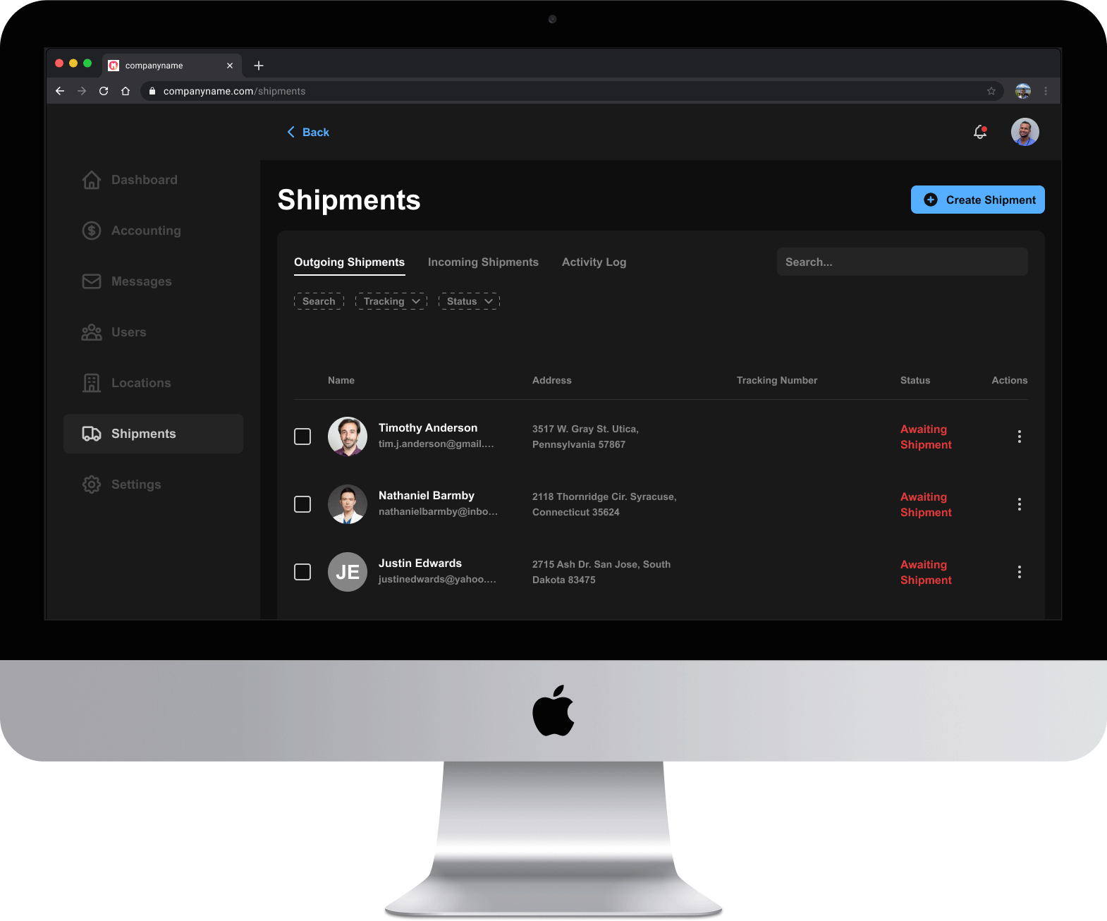
Creating a table in Figma now looks like this:

This approach speeds up the process for making new tables and standardizes design across the web dashboard.
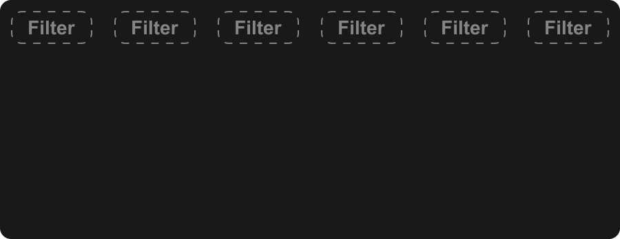
2. Designing a search and filter system
An engineering bottleneck established that search and filtering needed to be localized to tables. Global search would be tackled at a later date.
Competitor research uncovered useful insights from companies like Stripe.
As was the case with tables, the filter system needed to be easy to implement in designs across the dashboard.
Here is what the filter bar creation process now looks like. Also shown are inactive, hover, and active states.
3. Creating multi-select and mass actions
I created a system where available actions for rows become visible once a row is selected.
Selecting multiple rows only displays actions that can be performed en masse.
Actions for an individual row can also be reached through the ellipses on the right.
Here you can see the process for creating the available actions for specific tables from a base component. Hover and selected states are also shown.

THE RESULT
The design file now contains base components for creating tables. This results in three major improvements:
-
New tables can be created with much greater efficiency.
-
Less effort is required to make changes to tables across the design file.
-
Tables are now standardized across the platform.