
Background
Taking care of houseplants can be challenging for both novice hobbyists and plant enthusiasts.

Problem Space
Users need an easy way to identify plants, access information on care, and keep track of their plants.

Challenge
Creating a minimum viable product that adds value for both beginners and those with more knowledge. Time limit of 80 hours.
01 RESEARCH

Goals
-
Understand the plant care routines of hobbyists
- Identify pain points in the plant-care process
-
Uncover strengths and weaknesses of competitors

Methods
8 Individual Interviews: To understand how novice and advanced hobbyists take care of their plants
Competitor Analysis: To learn from those already active in this space
1 Subject-matter-expert Interview: To identify the key components to effective plant care
Competitor Analysis

ID through search and scheduling are consistent primary features.
More developed apps (Blossom and Planta) have premium features behind a pay wall.
All apps give the user the ability to ID plants, keep track of plants in their collection, find information on plant care, and schedule reminders.
Interview Findings

With plant care, there is no substitute for experimentation due to the large number of variables involved.

Ambiguity of instructions is a source of frustration for most users (what does "medium light" mean?).

Some novice users had tried and deleted competitor apps after following the suggested watering schedules only to have their plants die.

Most interviewees base watering decisions on observation (checking leaves, soil, etc).
02 DEFINE
Personas

Personas revealed that the needs and pain points of novice and serious hobbyists differ slightly.
Personas led to a POV exercise that resulted in the following how-might-we questions.
How might we...

encourage novice users to start experimenting and learning about plants' needs?

add value for advanced users who have many plants to take care of?


bring clarity to instructions, so users know what's expected of them?
How might wes defined the problems I needed to address in my design.
Feature Requirements & Site Map
Must Haves
Plant Identifier
Plant Information Card
My Plants
Nice to Haves
Watering Reminders
Houseplant Location
Surprising and Useful
Plant Diagnosis
Explore

A 10-participant card-sorting exercise validated the standard organization of features on competitor apps.
The site map also reflects the recommended prioritization of plant-care information obtained through my research and interview with a subject-matter expert. Watering and light are at the most important.
User Flow

Creating a userflow helped me visualize the basic steps a user would take from identifying a plant to setting a watering reminder.
03 DESIGN
Low-fidelity Wireframes

I used pen and paper to begin visualizing how the key features would be organized on the screen.
Mid-fidelity Wireframes
Plant-ID Flow

Watering Needs Flow

In developing my sketches, I refined the design further.
Logo Design


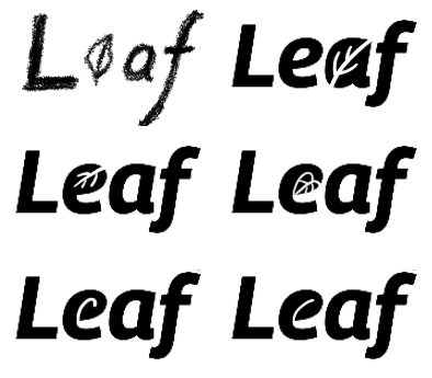
After settling on a name for the app, I was able to design this logo on Procreate.
Style Guide

I created a style sheet to ensure that the design remained consistent throughout the app.
I made tweaks to this as I worked through my high-fidelity wireframes.
High-fidelity Wireframes
I created 15 frames for version 1 of Leaf. Below are the main flows
Plant ID Flow

Watering Needs Flow

I reinforced the necessity of learning and experimenting by providing a wide range on the initial watering needs square. The user is nudged to discover more in-depth information where they learn that watering needs differ based on season.
In an effort to not overwhelm users, I presented watering information in simple bullet points. They can watch a quick video or tap the more-about-watering link to access more in-depth information.
I used color to give the user a subtle indication of where they are in the app. White background for general pages, light-green background for plant cards, and blue outline for watering instructions.
04 TEST
Usability Testing
I ran four participants through my Figma prototype, observing them as they completed a series of tasks.

With the exception of marking a plant as watered, all participants were able to complete key tasks. Even those who were able to mark a plant as watered commented that the UI was unclear.
Testing also revealed issues that I wasn't actively questioning for. These included:
-
My build was missing an account creation, password creation, and welcome screen.
-
Clicking on plant cards under the "Reminders" tab didn't provide any information of value. These screens were unnecessary.
-
No one wanted to watch the video on the "watering instructions" screen. Two participants cited unknown length as the reason.
-
The CTA wording of "add default photo" and "add your own photo" was confusing to users on the Add Plant flow.
-
There was no way to delete plants.
Major Revisions

Added two pages to the signup flow

Eliminated two unnecessary pages
Minor Revisions
-
Added a time indicator on video.
-
Changed wording for adding a photo to "take your own" and "use ours".
-
Added instructions for deleting a plant.
Conclusion and Reflections
-
Despite there being various successful competitor apps on the market, I was able to identify areas of frustration to address through design.
-
I was made acutely aware of the importance of usability testing as it revealed some major flaws in my initial design.
-
I got a sense of what can reasonably be accomplished in 80 hours.


